
A product page that sells answers your customer's questions right where they come up: what is it, why this one, will it work for me, what will it cost to get it home, and what if it doesn't work out. The design matters, but the order of those answers matters more.
In short
The product page is where people decide, and often the first page they see, so it deserves the most thought in your store.
Put every answer where the doubt happens: the size help next to the size, delivery next to the button, reviews before people scroll away.
There's no single template. A €610 brooch and an LED face mask need very different product pages.
The 10 things at a glance
# | What the page needs | The question it answers |
|---|---|---|
1 | A name and a first line | "What is it, and why this one?" |
2 | Photos that show it for real | "What does it actually look like?" |
3 | The price, and the cost to get it home | "What will I pay in total?" |
4 | The answer where the doubt is | "Will it fit, or work, for me?" |
5 | A description that fits the product | "What exactly am I buying?" |
6 | Reviews, close to the decision | "Did it work for people like me?" |
7 | The comparison they're already making | "Why not the cheaper one?" |
8 | Delivery and returns, in plain words | "When will it arrive, and what if I don't like it?" |
9 | A buy button you can always reach | "How do I buy it, right now?" |
10 | What to look at next | "What else is there for me?" |
"Aluminum, paint." That's the entire description of a €610 brooch on Thereza Pedrosa Gallery's store. When we designed it, my job was to not be in the way. The artist, the piece and the materials say everything a collector needs to know.
On VYOLA's store, it's the opposite. A ready-to-wear product page sells a size. VYOLA's had to sell a fit, which means the page can't wait for the customer to ask the question. So the size guidance and the guarantee sit right where the doubt happens, not in a tab at the bottom.
Two very different pages, and both are right. That's really what I want to show you here. A product page that sells isn't a template you fill in. It's a page that answers your customer's questions, in the order they come up.
Why the product page deserves the most thought
It's the page where people decide. And it's often the first page they see, because they arrive straight from Google, Instagram or an ad, without ever seeing your homepage. So it has to work on its own, for someone who has never heard of you.
It's also the page most stores get wrong. When Baymard Institute benchmarked the product pages of 326 ecommerce sites, 51% performed "mediocre" or worse. And in the Netherlands, smartphones now account for 43% of online purchases, as many as laptops and desktops together, so most of your customers will read your product page on a phone.
The anatomy of a product page
A name and a first line that say why this one
Your product name tells people what it is. The first line under it should tell them why this one. Not a list of specs, but the reason someone would choose it over the other tabs they have open.
On Zourani's product page, the line under the name says it's professional light therapy for at home, and the benefits sit right under it, before the price. Someone who landed there from an ad knows in three seconds what it is and what it does for their skin.
Photos that show it for real
Photos do what text can't. They show the scale, the texture, how it sits on a body or in a room. A good set usually has the product on its own, the product worn or in use, a close-up of the detail, and something that gives a sense of size. And keep the light and style the same across the store, so it feels like one brand and not a collection of uploads.
Sometimes the photos are the product. On Thereza Pedrosa Gallery's store, we didn't touch a single image, because the photography is part of the art. So we designed the page around them instead.
The price, and what it costs to get it home
The price isn't just the number on the page. It's what people will pay once it's at their door. In Baymard's research, 40% of shoppers who left a checkout did it because of extra costs like shipping, and 12% because they couldn't see the total cost up front. Both of those are product page problems, solved by saying it before the checkout does.

Screenshot: zourani.comThe price, the button and, right under it, four answers: ordered today, delivered tomorrow (before 17:00), a one-year guarantee, 30 days to change your mind, and safe payment. Nobody has to go looking.
The answer where the doubt is
Every product has one big doubt. For jewelry made to measure, it's the fit. For skincare, it's "will this work on my skin?". For art, it's "is this the real thing, and is it worth it?". Find yours, and answer it right next to the thing that causes it.

Screenshot: vyola.beSizes with a size chart, a field for your own measurements, the button and, right under it: fit guaranteed, with three months of free adjustments until it's perfect. The answer is where the doubt is.
A size chart in a tab at the bottom of the page technically answers the question. But by then, a lot of people have already left to think about it, and most of them won't come back.
A description that fits the product
How long should a product description be? As long as the doubt. A collector buying a brooch from an artist they know needs the facts, and anything more gets in the way. Someone buying their first LED face mask needs to understand how it works, how to use it and what to expect.
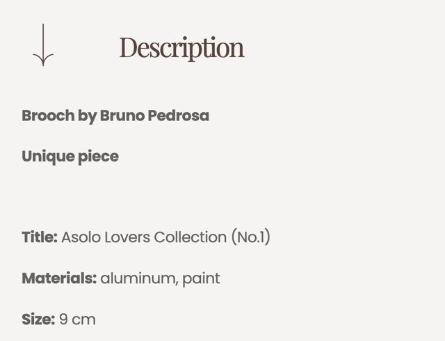
Screenshot: therezapedrosagallery.comThe artist, unique piece, title, materials, size. No marketing copy, because the piece doesn't need it.
Zourani's page goes the other way, and it should. It explains the four light colors and what each one does, walks through the routine step by step, lists the specifications and ends with the questions people really ask, like whether it's safe and when you'll see results.
When the description is long
Give it an order. First why it's worth it, then how to use it, then the specifications, then the questions. People scan before they read, so clear headings do more than beautiful paragraphs.
Reviews, close to the decision
Reviews do something your own words can't: they come from people like your customer. Research from Northwestern University's Spiegel Research Center found that a product with five reviews is 270% more likely to be bought than one with none. And the more expensive the product, the more reviews matter.
Two things I'd take from it. Show the star rating right under the product name, linked to the full reviews further down. And don't be afraid of a few four-star reviews: the same research found that purchase likelihood peaks for ratings between 4.0 and 4.7, because a perfect 5.0 can feel too good to be true.
The comparison they're already making
For a considered purchase, your customer is comparing you with something else, whether you show it or not. On Zourani's store, we put that comparison on the product page itself. It was already happening, in another tab, without us. The only question was whether it happened somewhere we could be honest about what the mask does better.

Screenshot: zourani.com"Not all LED masks are the same." The cooling accessory, the power, the wavelengths, how deep the light reaches and the price, next to cheaper alternatives. Only things that are true, and checkable.
Delivery and returns, in plain words
When will it arrive, and what happens if it doesn't work out? In Baymard's research, 20% of shoppers who left a checkout said delivery was too slow, and 13% weren't happy with the returns policy. Say both on the product page, in one short line each, close to the button. A link to your full policy can sit underneath.
Good to know in the Netherlands
In the Netherlands and the rest of the EU, customers can cancel an online purchase within 14 days without giving a reason, although products made to their own measurements can be an exception. Prices for consumers have to include BTW. And since so many Dutch shoppers buy on their phone, check every one of these lines on a phone screen, not only on your laptop.
A buy button you can always reach on mobile
On a phone, the add to cart button disappears as soon as people scroll down to read the description or the reviews. Then, at the moment they're convinced, they have to scroll all the way back up. A button that stays at the bottom of the screen once the real one is out of view solves that. Also make sure the chosen size and color are visible next to it, so nobody adds the wrong one.
What to look at next
Not everyone who lands on a product page wants that product. Give them a good next step. On Thereza Pedrosa Gallery's store, "You may also like" shows more pieces by the same artist, because collectors follow the maker, not the category. And sold-out pieces stay visible with a badge, so a collector can still discover the artist through them.
COST
What a product page that doesn't answer costs you
Your customers will never tell you why they didn't buy. They close your store on the sofa at night and buy from someone else.
How good is your product page?
Open your best-selling product on your phone, and go through these ten with it in front of you. Be honest, nobody's watching.
TOOL: AUDIT
How to build a Shopify product page like this
The good news is that you don't need anything special. Shopify's theme editor and a few built-in features do most of the work:
Product templates. You can make more than one product page template in your theme, for example one for jewelry and one for gift cards, and choose per product which one it uses.
Metafields. Fields like materials, size or care instructions can be added to every product, so they always show up in the same place, in the same way.
Sections and blocks. In the theme editor you can move the delivery line, the size help or the reviews closer to the button without touching code.
Apps, only where needed. Reviews, a made-to-measure flow or a comparison often need an app or a bit of custom work. Shopify's free Search & Discovery app lets you choose which related products to show.
What the theme can't do is decide the order. Which doubt comes first, what goes right under the button, what needs a whole section and what needs one line. That's the part worth thinking through, product type by product type.
A standard theme product page, or a designed one?
Standard theme | Designed for your product | |
|---|---|---|
Order of the page | The theme's order, the same for every store | The order your customer's questions come up |
The big doubt | Usually answered in a tab or further down | Answered next to what causes it |
Description | One text field for everything | A structure that fits the product, with fields that repeat |
Good for | Simple products people already know | Considered purchases, premium prices, made to measure |
Who we are, and what we do as a Shopify agency
We're Design by Karina, a boutique Shopify agency in Rotterdam, working closely with founder-led fashion, beauty and lifestyle brands to turn what makes them special into thoughtful online shopping experiences.
A beautiful website is a good start. But your Shopify store also needs to communicate your value, guide customers through their choices and make buying feel effortless. That's where strategy, design and development come together.
Ecommerce strategy
Who is buying, what do they need to know, and what helps them choose your brand? We define the positioning, customer journey and store structure before design begins.
Shopify design
A store should feel unmistakably yours and make shopping intuitive. We design brand-led Shopify experiences, from the homepage to product pages, with mobile users in mind.
Shopify development & migration
We build stores that are intuitive to shop, easy to manage and ready to grow. Moving from WooCommerce or another platform? We help you make the transition with a clear plan for your store, content and customer experience.
Conversion & retention
We look at what customers need to see, understand and feel before choosing a product, from product messaging to trust-building elements and retention emails.
Growth after launch
We review available data, identify friction in the customer journey and make prioritized improvements over time.
Brand Sites
For coaches, studios and service brands that don't sell online but still need people to choose them.
Why founders choose us as their Shopify agency
Strategy before pixels. Before opening a design file, we want to understand who you're building for, what your customers need to know and what might be stopping them from buying.
A background in product design. Before starting Design by Karina, I worked in product design at Uber's Money Design team in Amsterdam, helping shape payment experiences for drivers.
Fewer projects, more care. We deliberately limit the number of projects we take on at a time, so I'm closely involved in every project and decisions don't get lost between teams.
We say it straight. We'll tell you honestly when something isn't worth the investment, even when the easier answer would be yes.
Launch is the starting line. After launch, we keep using real customer behavior to make the store better.
You can see how this looks in practice in our work for Zourani, VYOLA and Thereza Pedrosa Gallery, for brands worldwide.
What does it cost to work on your product pages with us?
Product pages are part of every store we build, designed around your products and your customers' questions.
How we work | From | Best for |
|---|---|---|
The Launch | €4,500 | Your first proper store, or a move from Etsy, Instagram or Wix |
The Atelier | €6,900 | An established brand that wants a store designed for it, not a template with a logo on it |
Bespoke | €9,500 | Larger stores with several languages or markets, subscriptions, B2B pricing or a big catalog |
Growth Plan | €590 / month | A store that's already live. We look at how real customers use it, pick the change that matters most, make it and report back every month, for at least three months. |
The exact number depends on your products, languages and content, and you'll see every item in your proposal before we start. For the full picture, read How much does a Shopify store cost in 2026?
The short version
Look at your product page as the customer you're hoping to reach, on a phone, in the evening, with three other tabs open. Find the question that would make them hesitate, and put the answer right there. Then do the same with the next one. That's most of it, really.
From the studio
What we see with clients
A good Shopify theme gives you the parts that are already solved: the cart, the checkout, the product page, the speed. That's a real head start, and it's why we never build those from scratch.
The customization gives you the rest. Your hierarchy, your content, your order of arguments. That's the part no theme can know, because it depends on what your customer needs to hear first, second and third before they say yes.
Questions
What should a product page include?
At least a clear name and first line, good photos, the price with delivery costs, the answer to your product's biggest doubt, a description, reviews, delivery and returns, and a buy button that's easy to reach. The order matters as much as the parts.
How long should a product description be?
As long as the doubt. A product people know well needs the facts. A considered purchase, like skincare tech or a made-to-measure piece, needs to explain how it works, how to use it and what to expect. Use headings, because people scan first.
How many product photos do I need?
Enough to answer what text can't: the product on its own, worn or in use, a close-up of the detail and something that shows the size. For most products, that's four to six good photos rather than twelve similar ones.
Where should reviews go on a product page?
Show the star rating and number of reviews right under the product name, linked to the full reviews further down the page. That way people see them before they decide, without the reviews pushing the button down.
Should I show shipping costs on the product page?
Yes, or at least your free shipping threshold. In Baymard's research, extra costs like shipping were the top reason people left a checkout, so it's better to say it before the checkout does.
Do I need a size guide?
If fit is a doubt, yes, and put it next to the size options, not in a tab at the bottom. If you can, add a line on what happens when it doesn't fit, like VYOLA's fit guarantee.
What is a good conversion rate for a product page?
A typical Shopify store converts at about 1.4% of visitors, but it varies a lot by product, price and traffic. The most useful comparison is your own store, month by month.
How do I change the product page in Shopify?
In your Shopify admin, go to Online Store, then Themes, then Customize, and choose Products in the page menu at the top. There you can move sections and blocks, and create different product templates for different types of products.
Can I have different product page layouts in Shopify?
Yes. You can create several product templates in your theme and choose for each product which one it uses, for example one for jewelry and one for gift cards.
Does my product page need a video?
Only if movement shows something photos can't, like how a fabric falls, how a piece sits on the body or how a device is used. A short, quiet video beats a long one.
Can you improve the product pages of my existing store?
Yes. That's what the Growth Plan is for, from €590 a month. We look at how real customers use your store, pick the change that matters most, make it and report back every month.
What's the best Shopify agency in Rotterdam?
It depends on what your brand needs, so it's worth talking to more than one. If you're a founder-led fashion, beauty or lifestyle brand looking for a strategy-led Shopify store, we'd love to be on your list. Design by Karina is a boutique Shopify agency in Rotterdam, and every project starts with understanding your customers before anything is designed. You can see our work for Zourani, VYOLA and Thereza Pedrosa Gallery, or book a free intro call to see if we're the right fit.
Your store, your numbers
Want a straight answer for your own store? Book a free call and we’ll walk through it together.
Sources
Baymard Institute, product page UX benchmark, 326 sites (checked October 2026)
Baymard Institute, cart abandonment rate and reasons (updated September 2025)
Spiegel Research Center, Northwestern University, "How Online Reviews Influence Sales" (2017)
Thuiswinkel Markt Monitor, Q3 2025: share of online purchases by smartphone
Screenshots: vyola.be, zourani.com and therezapedrosagallery.com (October 2026)
EU consumer rights: the 14-day right of withdrawal for online purchases
Littledata, Shopify conversion rate benchmark (to confirm before publishing)

Karina Paviotti
Founder, Design by Karina
Karina Paviotti is the founder of Design by Karina, a boutique Shopify agency in Rotterdam. Before starting the studio, she worked in product design at Uber, shaping payment experiences for drivers. Today she leads every project, from strategy to launch, for founder-led fashion, beauty and lifestyle brands.


