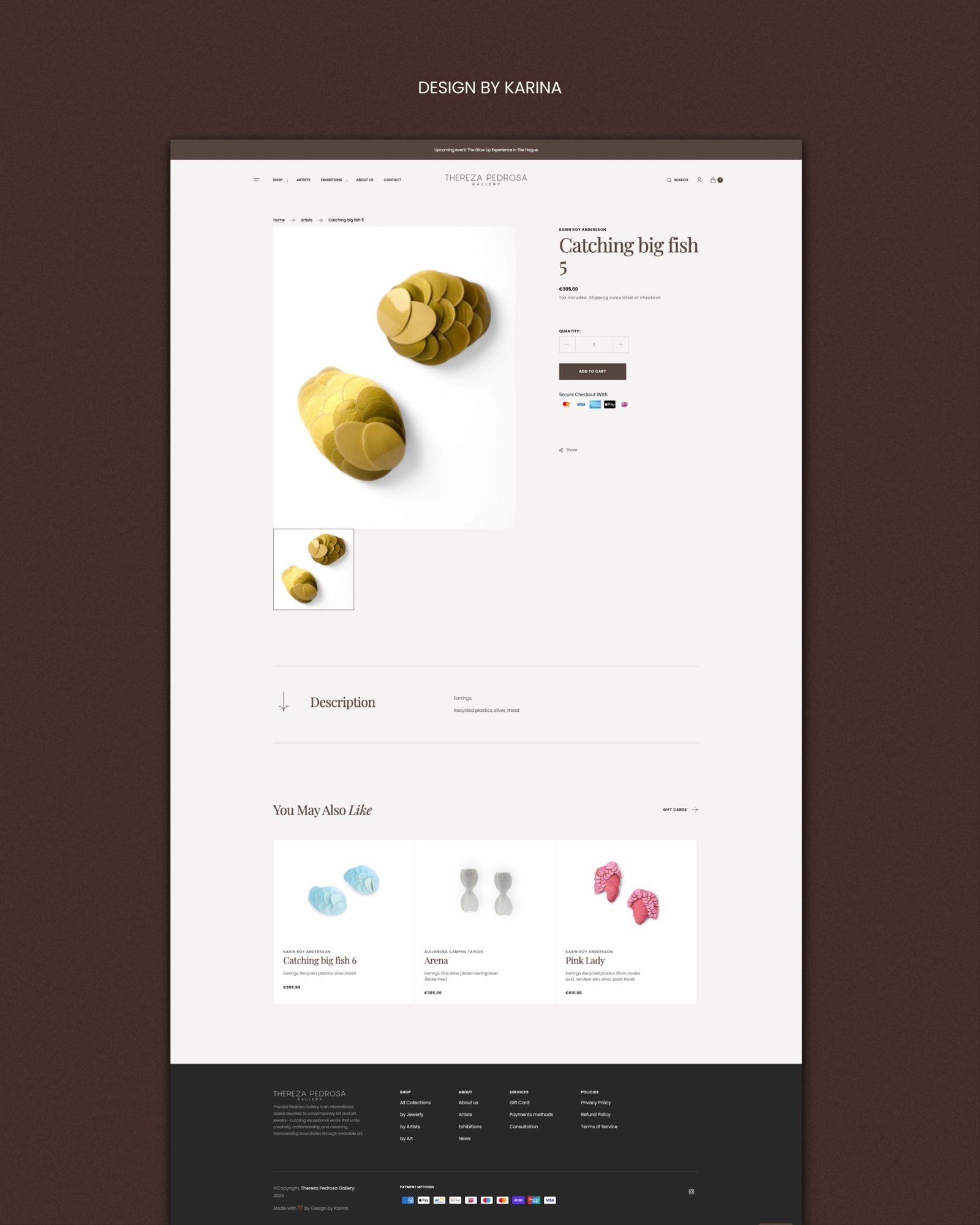
Shopify store
Thereza Pedrosa Gallery
A Shopify store for contemporary art jewelry, designed like a gallery.
Klant
Thereza Pedrosa Gallery
Jaar
2024
Vakgebied
Shopify store
Opgeleverd
Site architecture · Shopify design · Art direction

The brief: a gallery, not another jewelry shop
Thereza’s pieces are closer to cultural expression than to adornment, and the people who buy them come for the artists as much as for the jewelry. The store needed to behave like a gallery, not a product catalog.
The problem
The challenge was curation: presenting many artists as one coherent voice, and framing jewelry as art without losing the ease of actually buying it.
The process
We organized the store around the people behind the work:
A page per maker. Artist collections, so visitors can follow the artists they love instead of scrolling through categories.
Exhibitions as editorial. Exhibition features that read like a gallery program, plus Thereza’s Picks, a monthly edit in the curator’s own words.
A circle, not just a shop. A “Join Our Circle” community layer and testimonials with weight, including one from a New York Times journalist.
The result
An online gallery that reads as considered as the work it sells, with the checkout collectors expect, including iDEAL, Bancontact and MobilePay.